No feedback found for this session
BI for Beginners (service version) Session 3
Power BI
beginner
Session outline
- In this session, we’re going to build part of the GP practice size dashboard from last time
- But we’ll do this from raw data, rather than the play data we used last time
- We’ll bring that data in directly from the web
- We’ll need to wrangle that data to get it to behave
A word of warning
- data wrangling is one area where the web version of Power BI is much less capable than the desktop version
- that means that we’re going to use Excel/PowerQuery to do most of the heavy lifing for us here
- if the desktop version of Power BI is any guide, I’d hope that these tools will eventually be integrated into the web version of Power BI before too long
Data wrangling
- several different sources needed
Load our data
TipTask
- Open Excel and create a blank workbook

- In the
Datatab of the ribbon menu, select theFrom Weboption
- Supply the first URL

- Select
Load
- Repeat with the remaining URLs
- Save your workbook
Inspect our data
- You should be able to see each of your datasets in Excel as separate worksheets (with pretty horrible names)

PowerQuery
Next, we’ll open these three sets of data in PowerQuery by selecting Launch Power Query Editor... from the Get Data menu: 
Navigating PowerQuery

- on the left, you’ll see three queries, corresponding to the three datasets you loaded from the web
- in the centre of the page, you’ll see an Excel-like preview of your data
- above the data, you’ll see an Excel-like ribbon menu and formula area
- on the right, you’ll see the details of your query
Renaming our data
- To make life easier, we’ll rename each query by right-clicking the query title on the left-hand side of the screen
 :
:
- call the GP practice details
practices - call the NHS boards data
practices - call the demographic data
demographics
- call the GP practice details
Task list
- we can discard some of the practices data
- we’ll need to join boards and practices to get nice health board names in our dashboard
- we’ll need to re-shape demographics
- and we’ll need to send our wrangled data to Power BI
First steps in PowerQuery
- find your
boardsdata - (reminder about the duty of data minimization)
- we can safely lose several columns:
-
_id,HBDateEnacted,HBDateArchivedandCountryare all spare - right click the column header to
Remove
-
The big idea
- once you’ve removed a column, you’ll see a change to the
Applied Stepsarea:
- we’ve gained an extra step, showing that we’ve removed a column
Steps
- if you click an earlier step, you can see the state of your data at that point
- if you click the
Xto the left of the step, you can delete (effectively undo) that step - if you click the gearwheel to the right of the step name, you can alter the way that step worked
- if you’re code-confident, you can also tweak the PowerQuery M formula that appears in the formula bar
PowerQuery -> Excel
- Once you’ve removed the unnecessary columns, click
Close & Loadto commit your changes
- that will return your data to Excel
Excel -> Power BI
- from Excel, rename your tables
- call the GP practice details
practices - call the NHS boards data
practices - call the demographic data
demographics
- call the GP practice details
- ensure the .xlsx is saved
- connect to Power BI as before
Service vs Desktop
- we’ll need to do this slighly ungainly Excel -> PowerQuery -> Excel -> PowerBI route whenever we tweak our data
- on the desktop, PowerQuery is integrated into Power BI, which makes things much smoother
- this might be a good point to explore setting up a connection between your OneDrive and Power BI service as it’ll reduce the messiness of re-re-uploading data as you tweak it
Joining data
- there’s an HB column in both the boards and practices data
- we can link these up so that we can use the actual proper health board names in our dashboard
TipTask
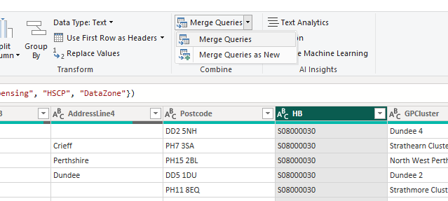
- select the HB column and select Merge Queries
- fill in the options in the merge pop-up
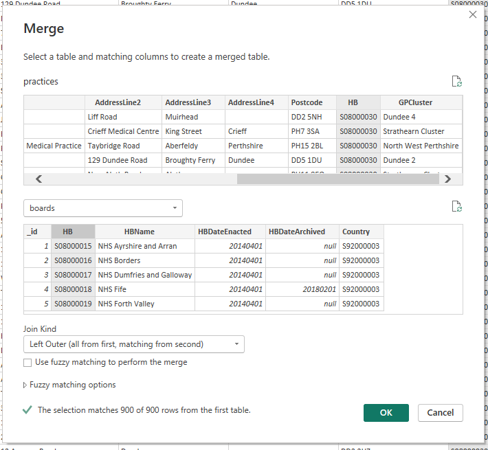
- note that this gives us lots of information about how the join is likely to work
- a slight puzzle: the join initially looks pretty unpromising
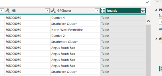
- here, Power Query is effectively telling you that there are several columns packed into this new column
- we can unpack all or some of the columns from each row using the menu in the column header.
- I think we only want HBName - but feel free to experiment as you can always backtrack from the query settings pane
TipTask
- select the column(s) you want to keep from the column header
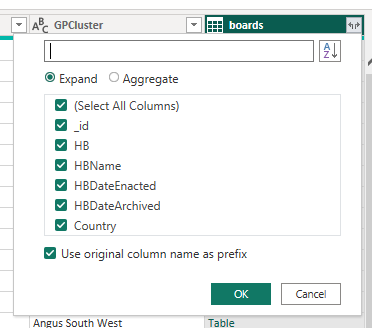
- you can also access lots of other Excel-ish options by right-clicking the column
- something we can do there is to rename this column to give a nicer name (which we’ll need to use later while building our visualisation)
TipTask
- please rename your new column to “HBName”
- note that you can also do this inside the formula bar at the top of the screen
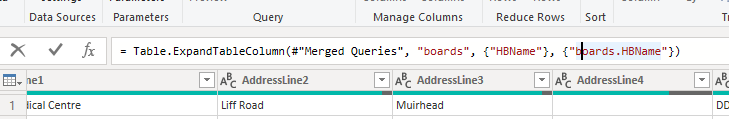 This formula is written in Power Query M, which we’ll discuss later
 - check that you now have nice board names in the practices data
- remember to close & apply
Re-shaping data
- our demographics data is going to be hard to plot
- Power BI generally expects data with one variable per column
- in this data, our useful variables (like the count of patients in particular age or sex brackets) are spread across several columns
- we’ll reshape it using Power Query to make our life easier
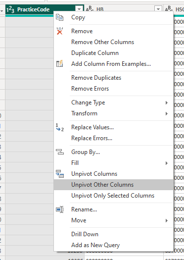
TipTask
- As before, please Transform Data
- Use the Select columns tool (or delete as before) to remove the id, Date, HSPC, HB, and SexQF columns
- You can do this in Power Query directly with
= Table.RemoveColumns(#"Changed Type",{"_id", "Date", "HB", "HSCP", "SexQF"}) - Select the PracticeCode and Sex columns, then select Unpivot Other Columns
- That should give us our data in long form, so that it looks like this:
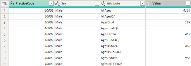
- this will make it easier to plot in Power BI as we usually need to have one variable (like number of patients in an age/sex bracket) in a single column
- we can now remove unwanted values by filtering
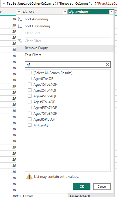
TipTask
- From the Attribute column, please remove the QF rows,
- From the Attribute column, please remove the AllAges rows
- From the Sex column, please remove the All rows
Transforming values
- the last type of reshaping to show off is about transforming values
TipTask
- Split the Attribute column by Digit to Non-digit
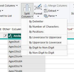
- replace values in the new Attribute.1 column to remove the “Ages”
- then in Attribute.2, two replacements to remove the “to”s and replace the “plus” with 99
- then rename the columns to age_upper and age_lower
- finally, change the data type to whole number for each of those new columns
Tidying up
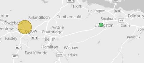
- we should now be able to use this data to re-make our GP bubble map from last time.
- there are some minor bits of tidying up that need to happen first
- there are a few duplicate practice names, which might cause us problems
TipTask
- select Transform data
- add a Custom column called Practice Name
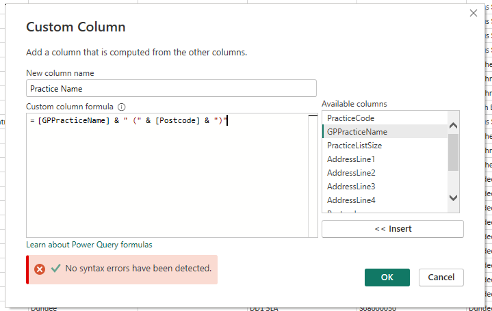
- use
&to concatenate values:[GPPracticeName] & " (" & [Postcode] & ")" - close and apply
- Power BI likes to summarize data wherever possible
- this can cause problems (although I don’t think there’s anything in this example that suffers from it)
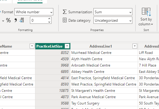
TipTask
- Go to the data view
- In the practices table, note that you can change the summary options for the PracticeListSize column
Re-making our visualisation
TipTask
- Add a map, and set the Postcode to Location, boards.HBName to Legend, PracticeListSize to Bubble Size
- Format the map to greyscale
- Rename for this visual to suit
- add a slicer for Health board
- add cards for the list size and practice name
- add a stacked column chart for practice sizes
Finishing up
- next time, we’ll use some of that data we wrangled today to extend our GP dashboard
- please save your files from today somewhere safe
- if you have time during the week, come back to the visualizations that we sketched today, and play. What would you like to add to the dashboard?
- there’s a lot of demographic data to play with
- Let me know, and we’ll try adding those things next time