No feedback found for this session
BI for beginners (session 2)
Power BI
beginner
NoteSession materials
Session outline
If you’d like to get a sense of the core content, you might have a look at the video outline for this session:
Visualisation overload!
- we’re going to build several visualisations
- we’ll use some tidied data for this - today is all about using data to do interesting things
- next time, we’ll get into the data wrangling needed to sort that data out
ETL
(as a preview of the next session)
- extract
- transform
- load
Today’s visualisations
- maps
- column charts
- line graphs
- numeric summaries of data
- filtering and slicing tools
The goal
TipTask
Open BfB_s02.pbix to have a look
Today’s data
TipTask
- Start a new report in Power BI
- Open
data/s02_data.xlsx - Select the two tables (
gp_sizeandweekend_service) and have a look at the preview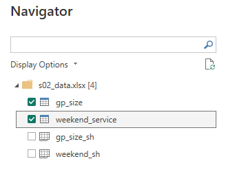
- Load those tables
Visualising service use
Finding our data
TipTask
- Go to the data view
- Open the
weekend_servicetable and inspect the data
Add a line chart
TipTask
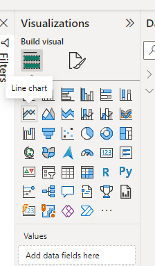
- Go to the report view
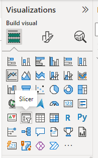
- Go to the visualisation pane, and add a line chart
- Expand it to fill the bottom three-quarters of the visualisation area
Add data
TipTask
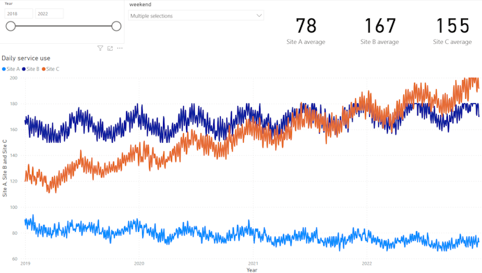
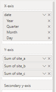
- Click the date column in the data pane, and drag the Date Hierarchy to the X-axis field
- Drag the three site columns to the Y-axis field
Add a slicer
TipTask
- Click off your line graph, then add a slicer
- Drag the year field from the Date Hierarchy into the slicer Field
- Add a second slicer in the same way
- This time, drag the weekend column into the Field
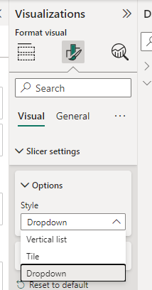
- Select the Format your visual menu
- Format the slicer to use a dropdown
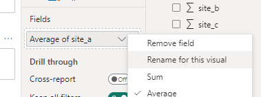
Add some cards
TipTask
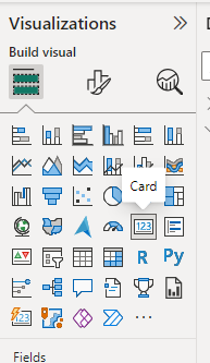
- Add a card
- Drag site_a into the Field
- Use the dropdown on Sum of site_a to select average
- Repeat for site_b and site_c
- Adjust the decimal places via the Callout value section of the format menu
Tidy up the names
TipTask
- Go round using Rename for this visual to tidy up the names
- Name the page of the report appropriately
End result
GP practice size
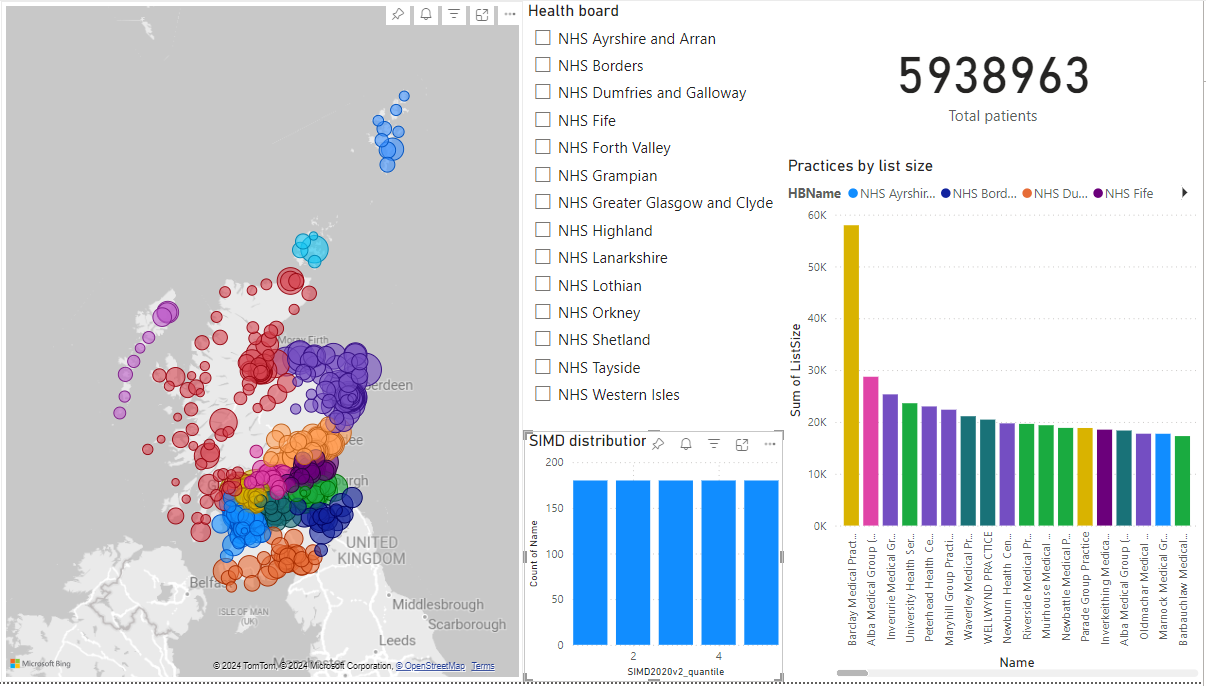
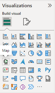
Add a map
TipTask
- Add a new page to your report
- Add a map and expand to fill the left-hand half of the visualisation area
- From the gp_size table, drag the Postcode column to the Location field
- Now drag the ListSize column to the Bubble size field
Format the map
TipTask
- From the Format visual menu, change the map style to greyscale
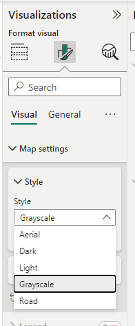
- (feel free to play around with the bubble size too)
Colour the bubbles by health board
TipTask
- Can you find a way of colouring the bubbles by health board?
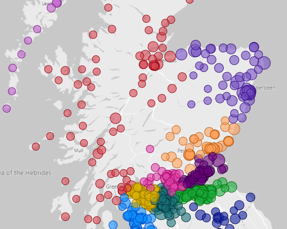
(add the HBName to the Legend field)
Add a slicer
TipTask
- Add a slicer for health board
- Use the Format visual options to change this to a dropdown
- Test what happens when you change this
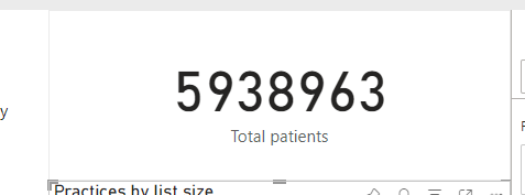
Add a practice details card
TipTask
- Add a card (new)
- Drag the ListSize and SIMD2020v2 columns to the Fields area
- Make sure that the SIMD2020v2 value is set to Min
- Add a title showing the practice name via the Format Visual options
- Format to suit
Add a column chart
TipTask
- Add a column chart
- Add the Name on the X-axis, the ListSize on the Y-axis, and the HBName in the legend
Tidy up the names
TipTask
- Go round using Rename for this visual to tidy up the names
- Name the page of the report appropriately
End result
Homework tasks
- Is there any relationship between practice size and SIMD2020 deprivation scores in the GP data? How could you show that relationship in a visual?
- Is there any month-to-month or seasonal change in the weekend service use data? How could you show that relationship in a visual?