BI for beginners (session 3)
Power BI
beginner
Previous attendees have said…
- 11 previous attendees have left feedback
- 100% would recommend this session to a colleague
- 100% said that this session was pitched correctly
NoteThree random comments from previous attendees
- practical and well-paced with lots of insights
- Very informative and useful to see how to pull together and manipulate multiple data sets within power BI
- Great session, very practical session using real world data.
Session outline
If you’d like to get a sense of the core content, you might have a look at the video outline for this session:
- In this session, we’re going to build part of the GP practice size dashboard from last time
- But we’ll do this from raw data, rather than the play data we used last time
- We’ll bring that data in directly from the web
- We’ll need to wrangle that data to get it to behave
Data wrangling
- several different sources needed
Load our data
TipTask
- Open Power BI and start a new report
- Use the Get data menu to load data from the web
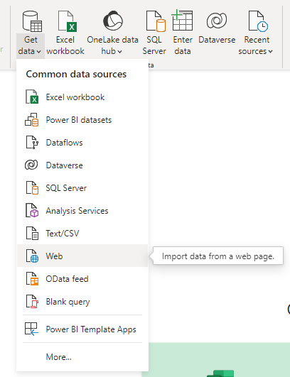
- Load each of the three URLs supplied in the chat
Inspect our data
- You should have seen a preview during data loading, but you should now inspect each of the data sets via the data view
- What will we need to do to use them to reproduce the dashboard from last time?
Task list
- My data came across with horrible names. Let’s rename to practices, boards, and demographics
- we can discard some of the practices data
- we’ll need to join boards and practices to get nice health board names in our dashboard
- we’ll need to re-shape demographics
Wrangling
- we’ll do our data wrangling using Power Query
TipTask
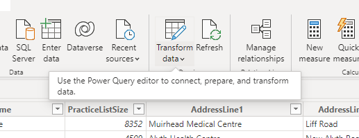
- In the data view, select Transform data
Discarding data
- (duty of data minimization)
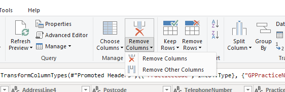
- we can safely lose several columns:
- TelephoneNumber, PracticeType, Dispensing are all spare
- HSPC and DataZone are more directly useful, although we actually won’t use them
- you can use the applied steps box in Query Settings to review (or undo) changes to your data
Joining data
- there’s an HB column in both the boards and practices data
- we can link these up so that we can use the actual proper health board names in our dashboard
TipTask
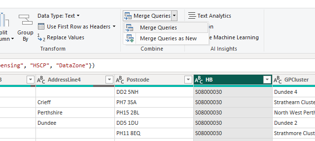
- select the HB column and select Merge Queries
- fill in the options in the merge pop-up
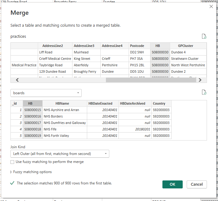
- note that this gives us lots of information about how the join is likely to work
- a slight puzzle: the join initially looks pretty unpromising
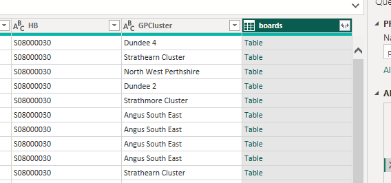
- here, Power Query is effectively telling you that there’s a table row packed into each of these cells. That row is the matching row from the boards data that matched our HB column in the practices data
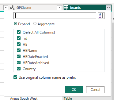
- we can unpack all or some of the columns from each row using the menu in the column header.
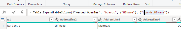
- I think we only want HBName - but feel free to experiment as you can always backtrack from the query settings pane
TipTask
- select the column(s) you want to keep from the column header
- you can also access lots of other Excel-ish options by right-clicking the column
- something we can do there is to rename this column to give a nicer name (which we’ll need to use later while building our visualisation)
TipTask
- please rename your new column to “HBName”
- note that you can also do this inside the formula bar at the top of the screen
 This formula is written in Power Query M, which we’ll discuss later
 - check that you now have nice board names in the practices data
- remember to close & apply
Re-shaping data
- our demographics data is going to be hard to plot
- we’ll reshape it using Power Query to make our life easier
TipTask
- As before, please Transform Data
- Use the Select columns tool (or delete as before) to remove the id, Date, HSPC, HB, and SexQF columns
- You can do this in Power Query directly with
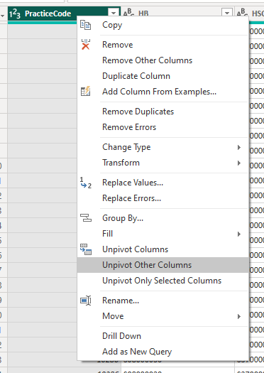
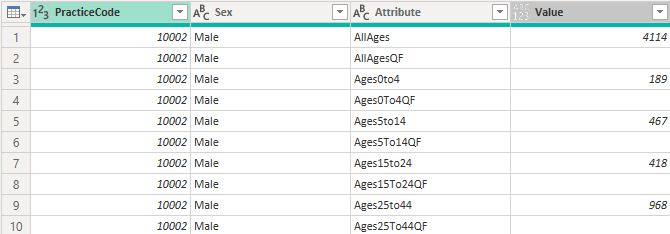
= Table.RemoveColumns(#"Changed Type",{"_id", "Date", "HB", "HSCP", "SexQF"}) - Select the PracticeCode and Sex columns, then select Unpivot Other Columns
- That should give us something that looks like this:
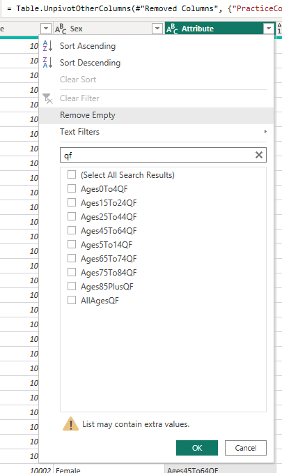
- we can now remove unwanted values by filtering
TipTask
- From the Attribute column, please remove the QF rows,
- From the Attribute column, please remove the AllAges rows
- From the Sex column, please remove the All rows
- the last type of reshaping to show off is about transforming values
TipTask
- Split the Attribute column by Digit to Non-digit
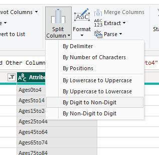
- replace values in the new Attribute.1 column to remove the “Ages”
- then in Attribute.2, two replacements to remove the “to”s and replace the “plus” with 99
- then rename the columns to age_upper and age_lower
- finally, change the data type to whole number for each of those new columns
Tidying up
- we should now be able to use this data to re-make our GP bubble map from last time.
- there are some minor bits of tidying up that need to happen first
- there are a few duplicate practice names, which might cause us problems
- so we’ll transform each name to include the postcode to avoid this happening
TipTask
- select Transform data
- add a Custom column called Practice Name
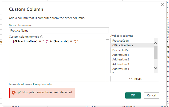
- use
&to concatenate values:[GPPracticeName] & " (" & [Postcode] & ")" - close and apply
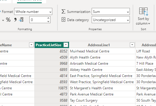
- Power BI likes to summarise data wherever possible
- this can cause problems (although I don’t think there’s anything in this example that suffers from it)
TipTask
- Go to the data view
- In the practices table, note that you can change the summary options for the PracticeListSize column
Re-making our visualisation
TipTask
- Add a map, and set the Postcode to Location, boards.HBName to Legend, PracticeListSize to Bubble Size
- Format the map to greyscale
- Rename for this visual to suit
- add a slicer for Health board
- add cards for the list size and practice name
- add a stacked column chart for practice sizes
Finishing up
- next time, we’ll use some of that data we wrangled today to extend our GP dashboard
- please save your file somewhere safe
- if you have time during the week, come back to the visualisations that we sketched today, and play. What would you like to add to the dashboard?
- there’s a lot of demographic data to play with
- Let me know, and we’ll try adding those things next time