Scope of the possible with Power BI
Power BI
overview
Previous attendees have said…
- 73 previous attendees have left feedback
- 99% would recommend this session to a colleague
- 96% said that this session was pitched correctly
NoteThree random comments from previous attendees
Session was very insightful
as ever a good session. Thank you
Good session, currently using power BI with a suite of dashboards built. Issues regarding IG would be really beneficial to discuss at length perhaps in a different session.
Why this session?
- Power BI is genuinely useful for health and care work
- but (like always) that recommendation comes with quibbles and qualifiers
- this session = non-technical, unvarnished advice about what Power BI does, where it shines, how it might help your service, and ways of putting it into action
Session outline
- what’s Power BI
- build-a-dashboard demo
- strengths and weaknesses
- alternatives
- skill development
Power BI?
- tool to build interactive dashboards
- newish (c.2015), proprietary, paid-for
- integrates functions from several Microsoft data products (bits of Excel, PowerPivot, PowerQuery…, SQL reporting products)
- a terminal analysis product: designed to make dashboards that users can use, rather that wrangle data/do statistical analysis
Power BI demo
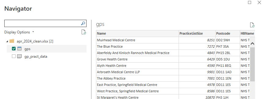
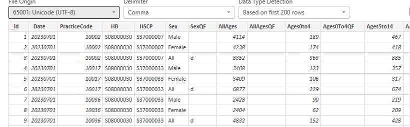
We’ll use a pair of Excel files. These are based on three datasets from the Scottish Health and Social Care Open Data portal:
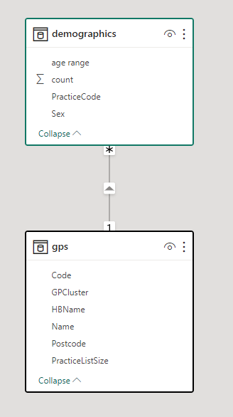
- GP practice size data - which is based on the GP practice details dataset and the Health Board 2014 - 2019 dataset
- Demographic data - which is based on the GP practice populations dataset
| Name | PracticeListSize | Postcode | HBName | GPCluster | Code |
|---|---|---|---|---|---|
| Newhills Medical Practice | 10056 | G34 9HQ | NHS Greater Glasgow and Clyde | NE - Easterhouse/Ruchazie | 46451 |
| Mossend Surgery | 6350 | ML4 1DQ | NHS Lanarkshire | Bellshill | 62011 |
| Brechin Medical Practice | 8652 | DD9 7AN | NHS Tayside | North East/Angus | 10498 |
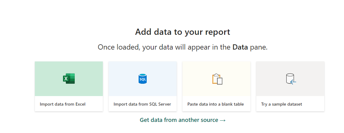
Load some data
Preview
Add to a map
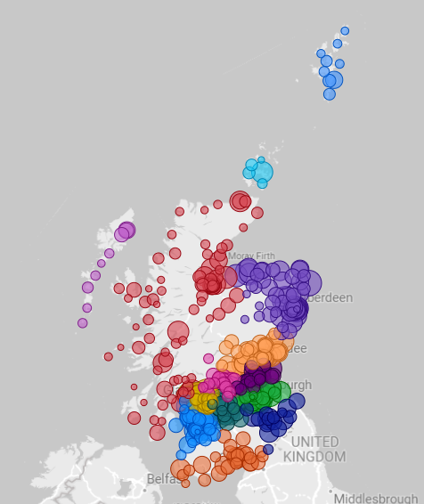
Add interactions
Publish
Add more visuals
Add more data
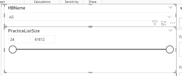
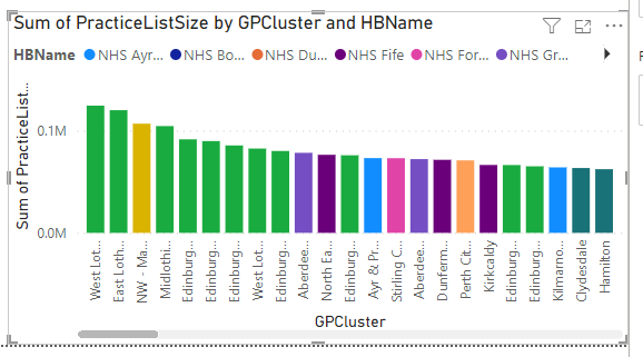
- we could add the health board names, to make our visual more useful
- we could also get GP practice demographics
Add more data
Re-shape that data
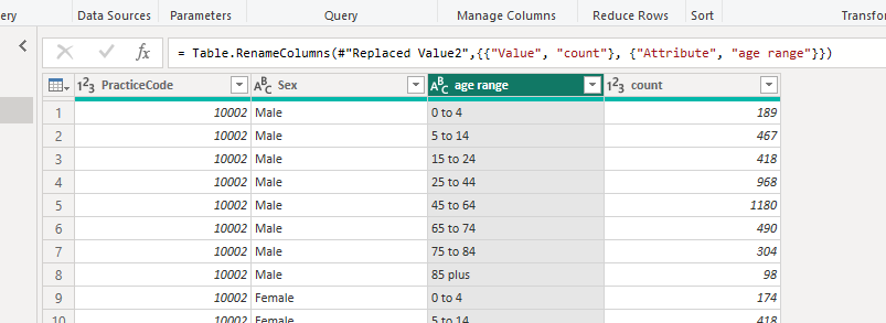
Data modelling tools
Pre-packed visuals
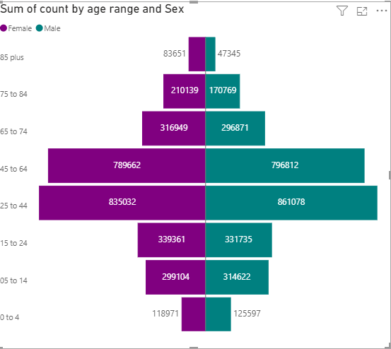
Demographics
Strengths
- by far the easiest way of producing simple interactive data products
- great tools for tidying data and wranging data sources
- shines as a way of data hubbing / self-service data
- happy with bigger data than Excel can handle
- nice iterative workflow
- scales well, especially if you’re working for a very large number of users
- potential to manage complex and sensitive data on existing infrastructure
Weaknesses
- terminal analysis product. Don’t expect/try to get data out of Power BI, it’s absolutely not designed to be used for that
- for most of us, users need to be licenced - or expect to spend extra money to make dashboards available to non-licenced users
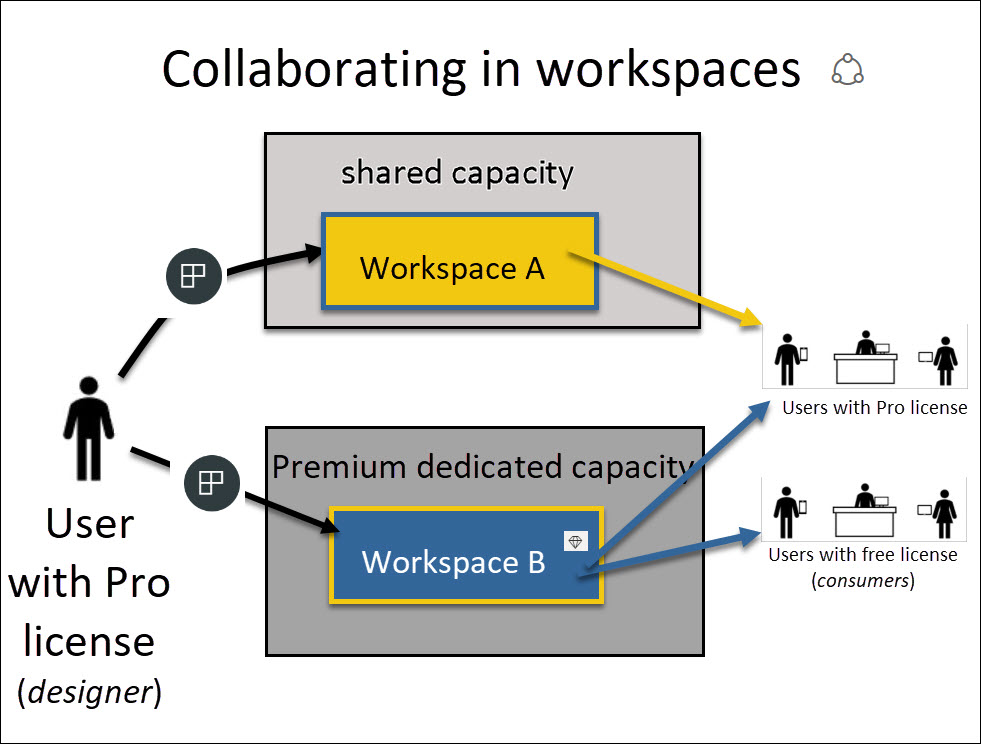
- cross-organisation use is really messy
- adding extra features (real-time data, e.g.) can be complicated and expensive
- steepening pain curve. Easy to start projects, but more involved analysis is messy
- complex IG landscape - reminder for NHS colleagues about national guidance on Power BI
- low-code, rather than no-code
Alternatives
Skill development
We have a range of different Power BI training options available. Please see the main Power Platform training page for details