Why bother with Power BI?
Power BI
pre-beginner
Previous attendees have said…
- 20 previous attendees have left feedback
- 100% would recommend this session to a colleague
- 100% said that this session was pitched correctly

NoteThree random comments from previous attendees
- A good demonstration of the abilities of PowerBI to present modern business intelligence type analytics. Would be really good if it was aimed at users, or the demand-side of analytics.
- An eye-opener to the utility of Power BI in aggregating and presenting data
- Gave an insight of advancement in tech that hopefully Procurement can use the same principle with products and logistics using the clinical model
Session outline
- an overview of Power BI
- quick production demo
- five ways that Power BI might help
- so what’s the catch?
- next steps and training
A brief overview of Power BI
- new-ish, c.2015
- integrates several existing Microsoft products (bits of Excel, PowerPivot, PowerQuery, various SQL reporting tools)
- produces interactive dashboards
- proprietary, closed-source, paid-for
Central idea
- data is complicated
- good data analysis helps make services better
- but predicting what data users will need is hard
Why are users so fussy about their data?
- data can be used to answer lots of different kinds of questions
- answering which/when questions
- seeing effects of changes
- comparing different areas
- looking at services over time
- …
Power BI demo
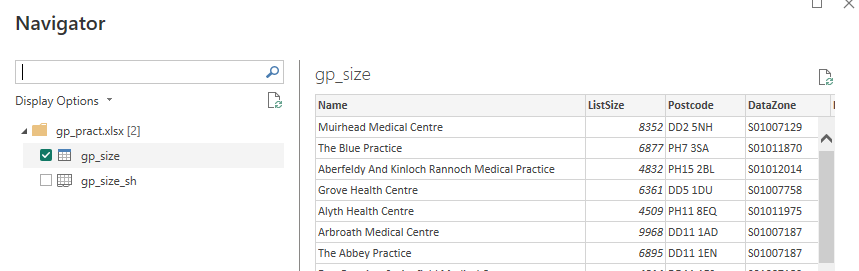
take a spreadsheet and load that data
preview the data
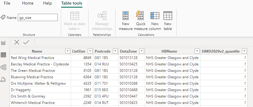
work with the data in Power BI
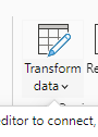
tidy/wrangle the data in Power Query
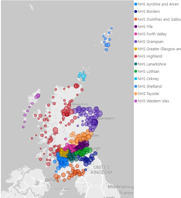
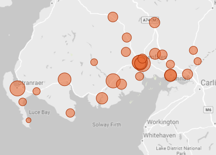
add a map visual
populate with our data
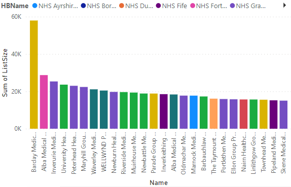
add a column graph
populate with drag and drop
add slicer
slicers change our visualisations
add a numeric summary

publish
See preview - although note that access might require permission
Five ways that Power BI might help you
1: making data fun makes data useful
2: you need a data hub
- Provides a standard way of accessing data from lots of sources
- call this a data hub
- great for sharing with a well-defined group
- an excellent way of guarding your spreadsheets
- useful for moving away from holding data on shared drives etc
3: the easiest way to build scalable dashboards
- lower barriers to entry than competitors
- scales really well (dashboard example)
- scaling isn’t free though…
4: don’t repeat yourself
- in Excel, when the data changes you need to re-do your work
- not so in Power BI: reproducible data loading pipeline
- possible route towards real-time data
5: let users serve up their own data
- bored of slicing up spreadsheets and emailing them to people? Let them do it themselves
- Power BI is a terminal product: it’s meant to be used at the end of a data journey
- don’t expect to do much fancy exporting from BI
Weaknesses
- Power BI needs tidy input data - so use Excel tables, and expect to get good at Power Query etc
- don’t believe the no-code lies - you’ll need some DAX and Power Query M
- publishing is complicated and potentially expensive and requires investigating before building a product
- complex IG picture across Scotland, so please get official guidance early
- a terminal analysis product, so don’t plan to take data from Power BI
- struggles with more complex statistical tools - a specific warning here about QI