No feedback found for this session
A first plot with Plotly
R
beginner
Introduction
This is a short practical session designed to walk users through creating a first plot in plotly. You’ll need at least a bit of prior R experience before, but assuming you’ve ever written an R script before, you should be fine. The session introduces some plotly basics, and compares their implementation with similar graphs in ggplot.
At a glance…
- plotly is the major alternative to ggplot
- the code is longer, but easier to understand
- the basics are better (accessibility and interactivity, especially)
- but there’s a much smaller plotly user base
- and it’s a big jump from either base R or ggplot
- the main reason you’re not using it already: the documentation is generally poor (although Sievert’s book is very good)
Setup
Starting a plot object
Note the plotly is interactive from the start - mouse over, see extra information, and control e.g. zoom from the top panel menu

Adding points
Two big differences:
- plotly will make an educated guess about the best way to represent your data, while ggplot doesn’t
- plotly uses
~to indicate how variables map onto axes etc, rather thanaes()
penguins |>
plot_ly(x = ~bill_length_mm, y = ~ bill_depth_mm) # will guess that points will workpenguins |>
ggplot() +
geom_point(aes(x = bill_length_mm, y = bill_depth_mm))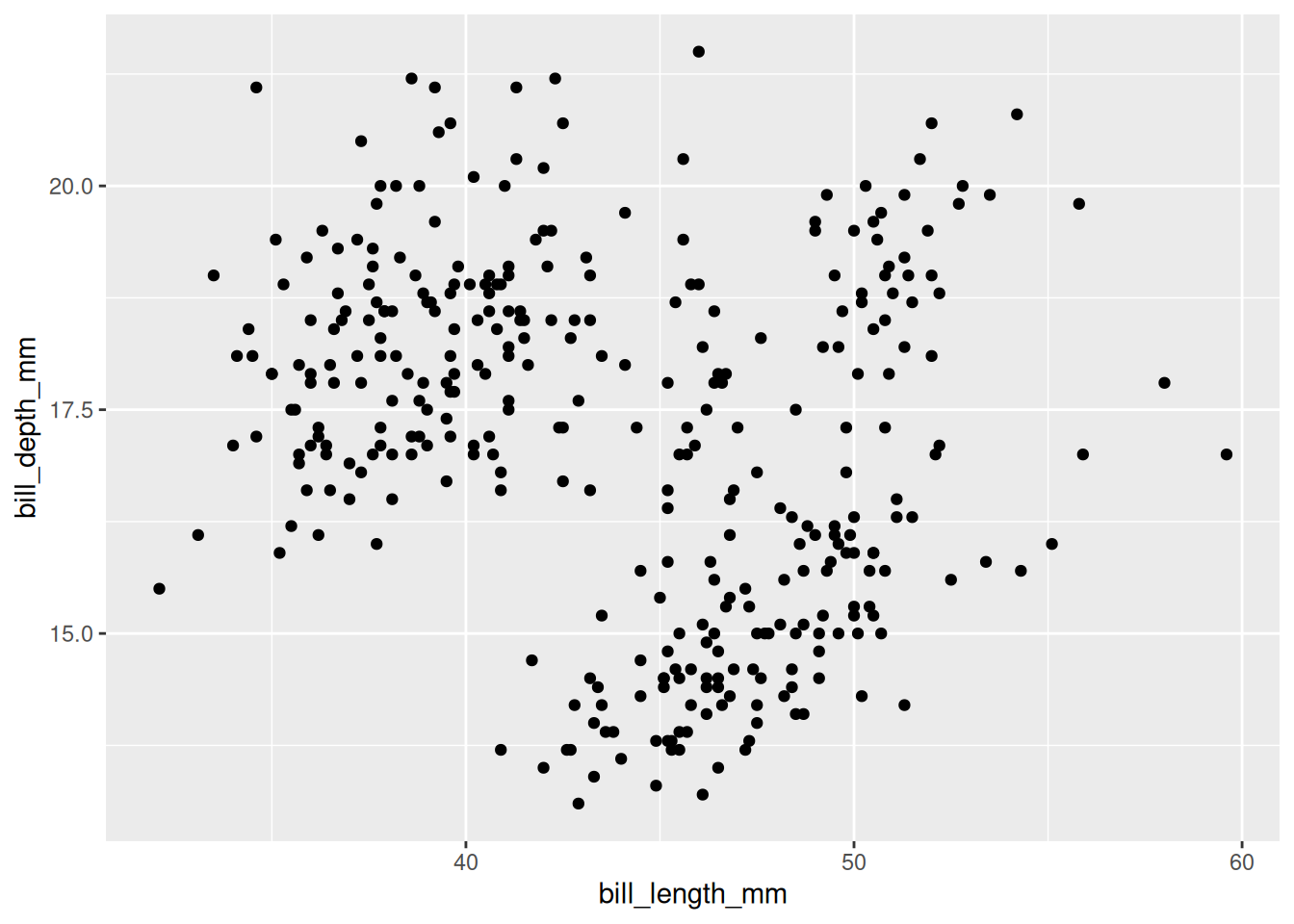
Changing the type of graph
Use a type argument. Useful starter options include…
- histogram (which does statistical work for you)
- bar (which plots the supplied observations)
- scatter
- box
penguins |>
ggplot() +
geom_histogram(aes(x = body_mass_g))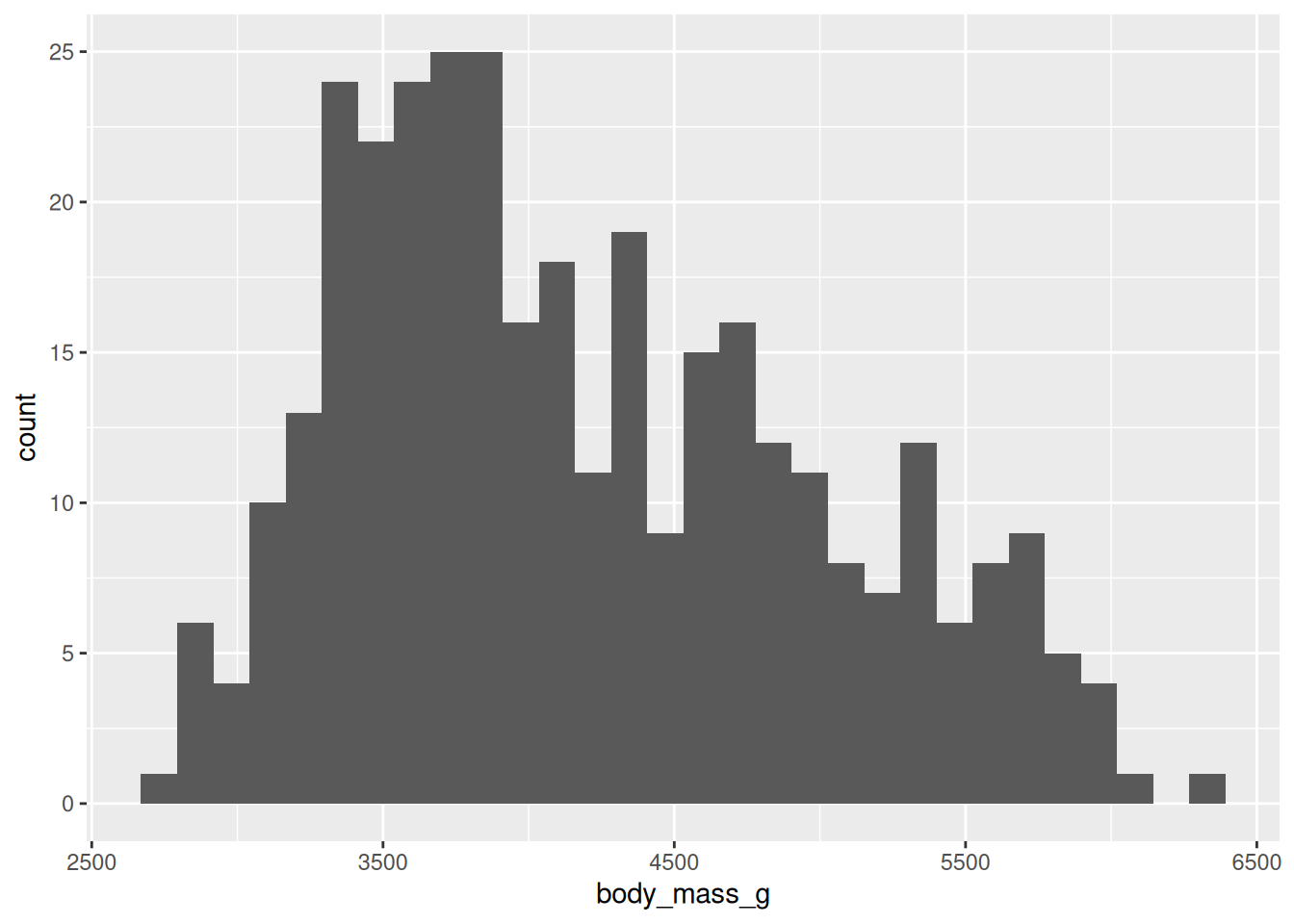
penguins |>
  ggplot() +
  geom_boxplot(aes(y = flipper_length_mm)) +
  xlab("Adding a manual label")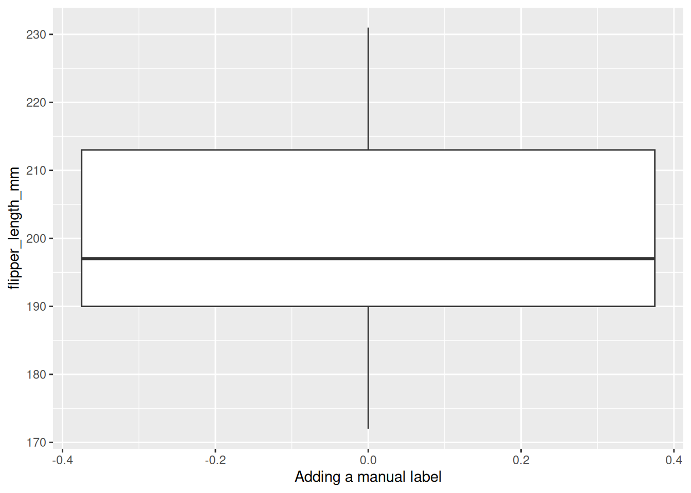
Non-spatial representations
penguins |>
  plot_ly(x = ~bill_length_mm,
          y = ~ bill_depth_mm,
          color = ~species, # non-UK spelling
          type = "scatter") # specify desired structure
penguins |>
ggplot() +
geom_point(aes(x = bill_length_mm,
y = bill_depth_mm,
colour = species))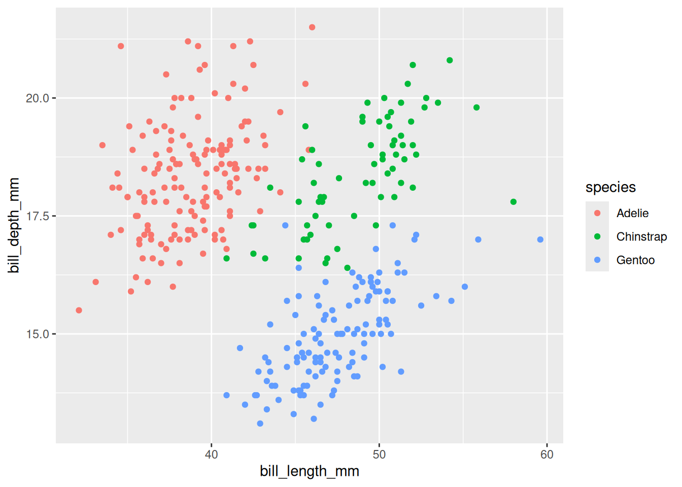
Styling
penguins |>
  plot_ly(x = ~bill_length_mm,
          y = ~ bill_depth_mm,
          color = ~species,
          colors = "Dark2", # using Rcolorbrewer palettes: https://cran.r-project.org/web/packages/RColorBrewer/refman/RColorBrewer.html
          type = "scatter") |> # specify desired structure
  layout(title = "100% pure plotly penguins",
         legend = list(title = list(text = "Three penguin species")))
penguins |>
ggplot(aes(x = bill_length_mm,
y = bill_depth_mm,
colour = species)) + # move the aesthetics in case we decide to get fancy
geom_point() +
ggtitle("Proudly pluralistic about ggplotting penguins") +
labs(colour = "A penguin-type trio") +
scale_colour_brewer(palette = "Dark2") # matching colorbrewer palette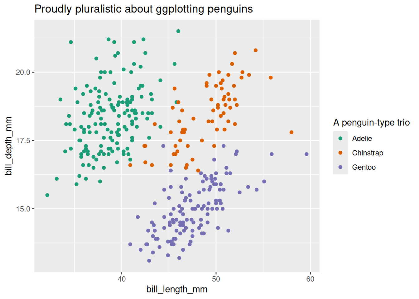
Extra series
penguins |>
  plot_ly(y = ~bill_length_mm,
          color = ~ species,
          type = "box",
          boxpoints = "all",
          jitter = 0.3,
          pointpos = -1.8) |> # this has been the hardest example to grasp: adding a second series is idiosyncratic, and seems to depend on the type of plot you're producing in the first instance
  layout(title = "100% pure plotly penguins",
         legend = list(title = list(text = "Three penguin species")))
penguins |>
ggplot(aes(x = species, y = bill_length_mm, color = species)) +
geom_boxplot() +
# geom_jitter(width = 0.2, height = 0.1) +
geom_point(position = position_nudge(x = -.5)) + # as far as I can tell, either nudge or jitter, but not both
ggtitle("100% genuinely ggplotted gentoos") +
scale_colour_discrete(name = "Three penguin species")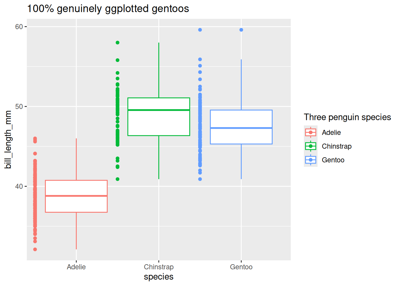
Bonus
plotly
penguins |>
  plot_ly(type = "splom",
          color = ~species,
          dimensions = list(
            list(label='flipper_length_mm', values=~flipper_length_mm),
            list(label='bill_depth_mm', values=~bill_depth_mm),
            list(label='bill_length_mm', values=~bill_length_mm),
            list(label='body_mass_g ', values=~body_mass_g )
                            ),
          diagonal=list(visible=F))