No feedback found for this session
Tableau for Beginners (session 3)
Tableau
beginner
WarningWarning
This is currently a draft version of the materials for this training session, and so may contain minor errors and inaccuracies.
Session outline
- today’s session is all about data wrangling
- we’ll take the raw data files used to produce the data we used last week
- we’ll import them into Tableau and organize them
- then we’ll tidy them up as needed
- we’ll aim to re-create the GP practice map from last week as a final objective
Session files
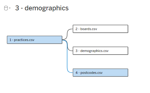
- four .csv files
-
1 - practices.csvfrom PHS’s opendata portal -
2 - boards.csvrom PHS’s opendata portal -
3 - demographics.csvfrom PHS’s opendata portal -
4 - postcodes.csvfrom the Scottish Postcode Directory - although note that the supplied file is a small subset of this larger directory
-
- link to completed dashboard
Getting started
TipTask
- go to https://public.tableau.com/app/
- select
Web Authoringfrom theCreatemenu
- from the
Datamenu, selectNew Data Source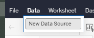
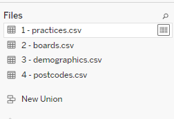
- drag and drop (or use the upload button) to add the
1 - practices.csvfile - repeat to add the other three files
Add each files to the data model
TipTask
- now double-click each of your data files to add them to the data model
- Tableau should guess the relationships in your data, and show these relationships by unbroken lines
- but one of these won’t work properly

- link the two
Practice Codefields together to relate these parts of the data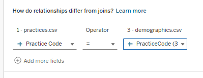
- you should end up with four data sources, all related together
Trying out our data
TipTask
- create a new worksheet

- re-create the map:
-
LatitudetoRows- and ensure you set this as a dimensionc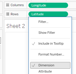
-
LongitudetoColumns- again, dimension -
GP Practice NametoDetail -
HB NametoColour
-
Demographics
TipTask
- demographics has lots of cols
- unlike the example in session 2, we don’t have a
Measure Valuesitem to play with - go back to the data, which is hard to work with
- hide all the QFs
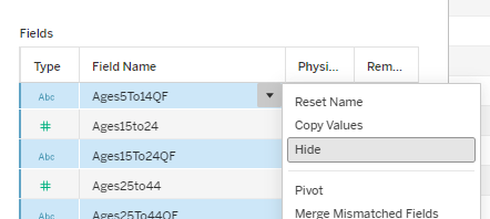
- now pivot the data
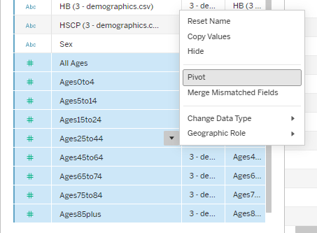
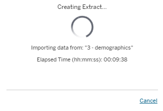
- it’ll take some time to perform the extract, but once you’ve returned to your worksheet, you should now be able to plot the demographics
Going an easier way
- we recommend using Excel and PowerQuery (or other tools) to pivot your data if possible
- if you don’t have this available, you can find a pre-pivoted dataset in the training materials (
3b - demographics_p.csv)
TipTask
- Open your dataset (
3 - demographics.csv) with Excel - convert the data to a table by selecting somewhere within it, and pressing
Ctrl+T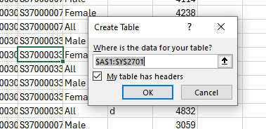
- then select
Data >> From Table / Rangeto open PowerQuery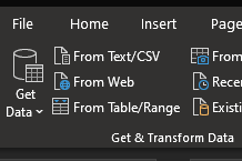
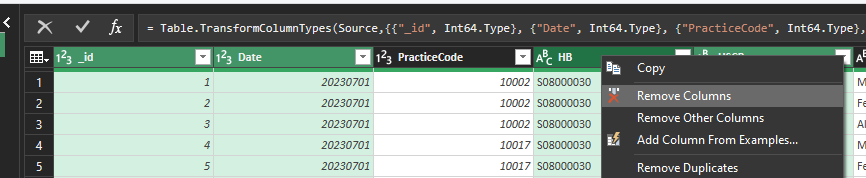
- Use the Remove columns tool to remove the id, Date, HSPC, and HB columns
Re-shaping data
TipTask
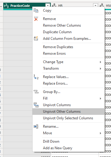
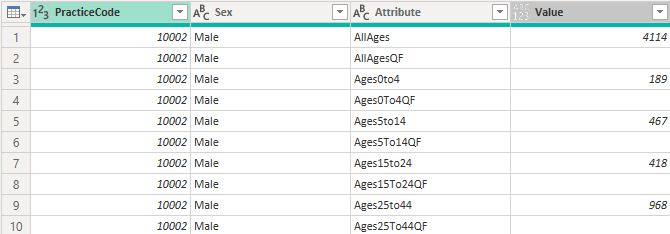
- Select the PracticeCode and Sex columns, then select Unpivot Other Columns
- That should give us our data in long form:
- we can now remove unwanted values by filtering
TipTask
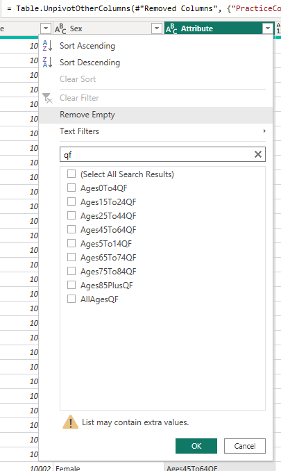
- From the Attribute column, please remove the QF rows,
- From the Attribute column, please remove the AllAges rows
- From the Sex column, please remove the All rows
Transforming values
- the last type of reshaping to show off is about transforming values
TipTask
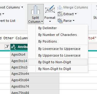
- Split the Attribute column by Digit to Non-digit
- replace values in the new Attribute.1 column to remove the “Ages”
- then in Attribute.2, two replacements to remove the “to”s and replace the “plus” with 99
- then rename the columns to age_upper and age_lower
- finally, change the data type to whole number for each of those new columns