Intermediate Power BI (session 5)
This session is part of our intermediate-level Power BI desktop course. The course structure is as follows:
- session 1: a simple build-a-dashboard session as a warmup, reminder about core Power BI techniques, and sharing some suggestions for good workflow practices
- session 2: DAX language foundations, including FILTER and CALCULATE
- session 3: core PowerQuery functions to manage sources, join data sets, pivot, and tidy values
- session 4: PowerQuery M language foundations, including a basic overview of syntax, a core function toolkit, advanced mode, and reproducibility
- session 5 (this session): a second, more ambitious, build-a-dashboard session to put all that PowerQuery and DAX knowledge into practice
We usually expect participants to take the five sessions together in order. This course broadly follows-on from our BI for Beginner course, and assumes that you’re happy and confident applying all that material. We’d usually expect participants in the intermediate course to be capable of independently building a simple dashboard in Power BI. You’ll also need Power BI Desktop to complete the live sessions - the web/Teams versions of Power BI won’t work.
Previous attendees have said…
- 22 previous attendees have left feedback
- 95% would recommend this session to a colleague
- 100% said that this session was pitched correctly
- Complex subject well taught with examples
- Again, managed to follow along but was all new to me, but well explained. It was reaching territory starting to stretch to my limits at the end. Stretched but not broken. Thanks very much, it is just incredibly valuable to have the KIND network and these sessions available. An incredible resource.
- definitely a session for the more geek-inclined but useful to understand more about the structure of pqm
Session aim
- we’ve had four content-heavy training sessions so far
- session five is about putting your new skills into practice in a collaborative environment
This is a collaborative session. You’ll be working in small groups to develop a dashboard. That means that you should expect to be an active contributor to that group throughout the session.
Session outline
- an entirely practical build-a-dashboard session
- we’ll use The Care Inspectorate’s public datastore, which contains a lot of rich data about Scotland’s care sector
- you’ll be putting your Power BI skills to the test on this data: what can you show us?
- you’ll be working in small groups, doing team programming
- Select
Get data from weband supply the link: https://github.com/NES-DEW/KIND-training/raw/refs/heads/main/bi_training/data/MDSF_data_30%20November%202024.xlsx - load the
datatable and theField Definitions Listworksheet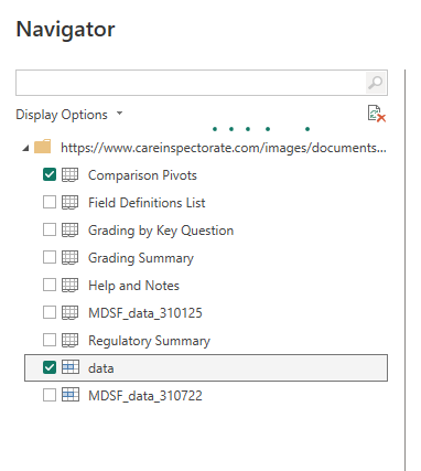
- then use
Transform datato fix theField Definitions List- remove the top 4 rows
- promote the headers
- Fill down the category column
Setup
- the dataset is available at https://github.com/NES-DEW/KIND-training/raw/refs/heads/main/bi_training/data/MDSF_data_30%20November%202024.xlsx - the core information is in a named range called
datain theMDSF_data_301124worksheet - download that data and inspect it in Excel
- have a think about which Power BI skills you’d most like to practice in this session
Personae
We’ll be working collaboratively to design a dashboard. More specifically, we’ll ask you to group programme. This means that every member of the group has an identified role and responsibility. These are:
- the author, who is the person who actually writes the dashboard in Power BI. They’ll share their screen, they’ll make all the changes in Power BI, and everyone else will tell them what to do
- the presenter, someone who keeps an overall eye on the work, and takes charge of presenting your work-in-progress dashboard to the whole group when we catch-up. That would ideally be someone with some subject-matter expertise
- some data engineers to think about the raw data, understand what it means, and how to make it behave for your dashboard via e.g. PowerQuery
- some front-end engineers - again, a couple of people to think about how the dashboard page itself should look, any DAX formulas etc you might need, and how the report page helps tell the story you want to tell
Schedule
We’ll work through a series of small- and whole-group sessions to develop the dashboard. The
- 15 minutes: initial exploration of the data, and idea generation
- 5-10 minutes: re-join for troubleshoot and chat
- 15 minutes: data wrangling
- 10 minutes: break
- 20 minutes: report draft
- 10 minutes: re-join for chat
- 10 minute: polish and refine
- until session end: showing off and suggestions
Telling a story
Good dashboards tell a specific story about the data. That usually means making some clear decisions about only exploring parts of the available data. In the first small-group session, you’ll have a look at the data, and try to develop a clear objective for your eventual dashboard. Some suggestions to help you do that:
- do you want to talk about data that is national, regional, or local?
- do you want to show a snapshot of something, or show change over time (e.g. inspection ratings)?
- do you want this dashboard to be self-contained from the provided data, or would it help to bring in other sources of open data?
- about care in general, or something more specific?
- about inspections, service organisers, service users?
Conduct
- be kind: we’re all here to learn
- I’m here throughout: message me in case of any difficulties
- nominate one person to share their screen, and work on the report
- other people navigate, direct, suggest, and look up
- start small and iterate