Pivot tables and pivot charts (intermediate Excel session 4)
excel
intermediate
Excel skill-builder
This is a session in our intermediate-level Excel skill builder course. This consists of five practical training sessions, designed to be taken together, that are aimed at helping users with some prior Excel experience build and consolidate their skills. The sessions are:
- Excel foundations 1
- Excel foundations 2
- Lookups in Excel
- Excel programming
- Pivot tables and pivot charts (this session)
NoteSession materials
Previous attendees have said…
- 42 previous attendees have left feedback
- 100% would recommend this session to a colleague
- 95% said that this session was pitched correctly

NoteThree random comments from previous attendees
- Very useful - will put into practice immediately!
- This session felt like it was more targeted to people who had never used pivot tables, I have used pivot tables for many years but I still learned something from this course! Everyday is a school day and just because you use something everyday doesn’t mean you are an expert!
- I’m not always able to free up time to attend the full session, I think it would be a good idea to record and build up a library that users can revisit. Brendan is excellent at going through these lessons, making it very engaging
Session outline
- Pivot tables
- Pivot charts
- Slicers
- Conditional formatting
Getting started
- files for today:
-
s05_exercises.xlsxis a starting-point for the exercises today -
s05_exercises_final.xlsxis the end-point for the exercises today - it’s there to help if you get stuck or lost
-
TipTask
- Open the sample spreadsheet
s05_exercises.xlsxand have a look around - Switch to the service use data in the
weekend_shsheet
What’s this all for?
- this data is complicated
- we want to find out when our service is busiest
- that’s hard to do manually - we can’t just inspect it by eye
- we’ll need to summarise our data
- two key concerns
- we want to do that safely
- we also want to do that efficiently
- this session (and the previous ones) give some key methods for effectively summarising Excel data
- most importantly: be clear about where your data lives, and where your summaries will live
Pivot tables
- the key summary tool in Excel
- making a new pivot table is easy
- and will give us an answer to our summary question quickly
TipTask
- Open the
s05_exercises.xlsxfile - Go to the
weekend_shworksheet - Select the
weekend_servicetable (click inside it andCtrl+a) - Press
Alt,N,V,T(or from the ribbonInsert >> PivotTable), and click OK to insert a pivot table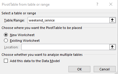
- Switch to the new worksheet containing your new (blank) pivot table
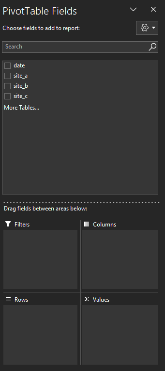
Adding data to a pivot table
- next, we need to tell the pivot table which data we want to summarise
- we’ll use the PivotTable Fields interface to control this
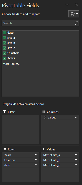
- we want to find the busiest days for each quarter for each site, so we:
- drag the three
site_columns to the Values field - then, using the dropdown, change the Value Field Settings to Max
- (the Columns field should automatically populate with Values)
- drag the date column to the Rows field
- drag the three
Improving our pivot table
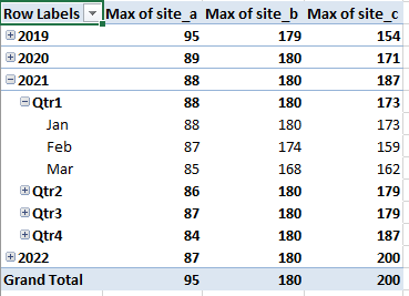
- that gives us a simple pivot table, showing us the peak values for our service
- we can also add a PivotChart instantly - click on your pivot table, and press
Alt + F1- play with the expansion buttons - the PivotChart should update to reflect the way that your PivotTable is currently arranged
PivotTable tips
Note
- Double-click any cell in a PivotTable to see the underlying data
- Group PivotTable items using:
-
Shift+Alt+→(right arrow) to add items to a group -
Shift+Alt+←(left arrow) to ungroup
-
- Add a new calculated field using
Ctrl+Shift+=(equals) - Delete an entire PivotTable using
Ctrl + Athen pressingDel
PivotTable pages
- we can split out parts of a PivotTable to separate worksheets
TipTask
- Drag the Years item to the Filters field. This should update the PivotTable so that only one year’s data is present at once
- We can also split each year into its own worksheet: find the option in the PivotTable Analyze section of the ribbon - or via
Alt,J,T,T,P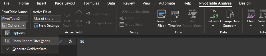
Slicing
- one slicer can control many PivotTables
TipTask
- Click within one of your new annual PivotTables
- Add a slicer from the insert menu (or
ALT,N,S,F) - Select date to slice on
- When the slicer appears, right click and select “Report Connections…” and add the other annual PivotTables
- Now select a couple of months from your slicer, and see the effect on your PivotTables
- if you’re working with dates, you can also use the timeline, which works in exactly the same way. Insert with
ALT,N,S,T, update the connections, and you can get fine-grained control over which date-ranges contribute to your PivotTable
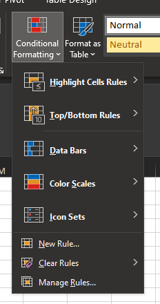
Conditional formatting
- generally useful for shorter data and simpler summary queries than PivotTables
- duplicated values
- max values
- loads of pre-packed options for conditional formatting
TipTask
- Switch to the
Conditional formattingworksheet - From the ribbon, explore some of the pre-packed conditional formats
Conditional formatting rules
- for more sophisticated conditional formatting, formatting rules can be specified and edited using the conditional formatting rules manager
TipTask
- Add a pre-packed conditional format to your table
- Bring up the conditional formatting rules manager using
ALT,H,L,R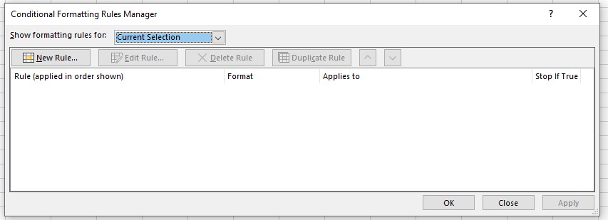
Custom conditional formatting
- again, there are pre-set formatting rules available
- we can also write a custom formula
TipTask
- To find the max value in a row, use the formula
= A2 = MAX($A2:$E2)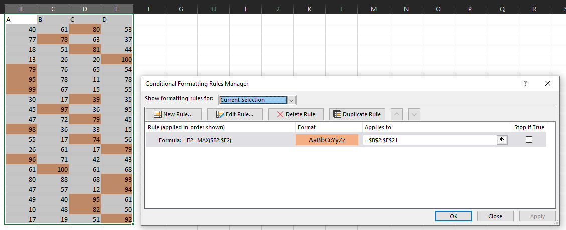
- Try adding extra rules and experimenting with how they interact
Thank yous
I’m grateful to Jennifer Watt, John Mackintosh, Duncan Sage, David Coigach, Michael Robb, Angela Godfrey, Spela Oberstar, Andrew Christopherson, and other members of the KIND network for their valuable suggestions and corrections to these training materials